POST—

EXHIBITION

IDENTITY.
JUN°26

CHI

POST—

EXHIBIT

IDENT.
JUN°26

CHI

/
Scroll to explore more
ART DIRECTOR
Capstone Identity design
Framing the Shift
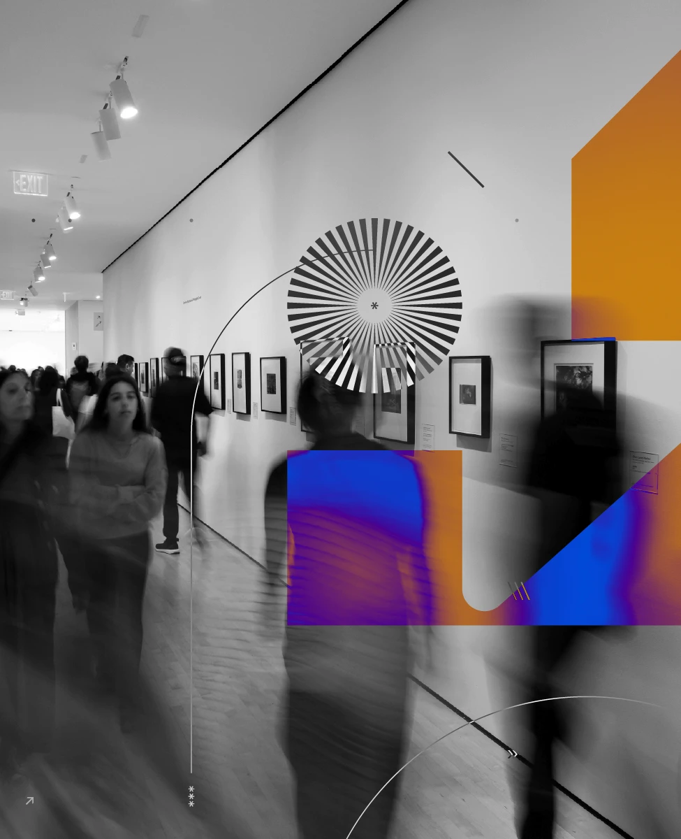
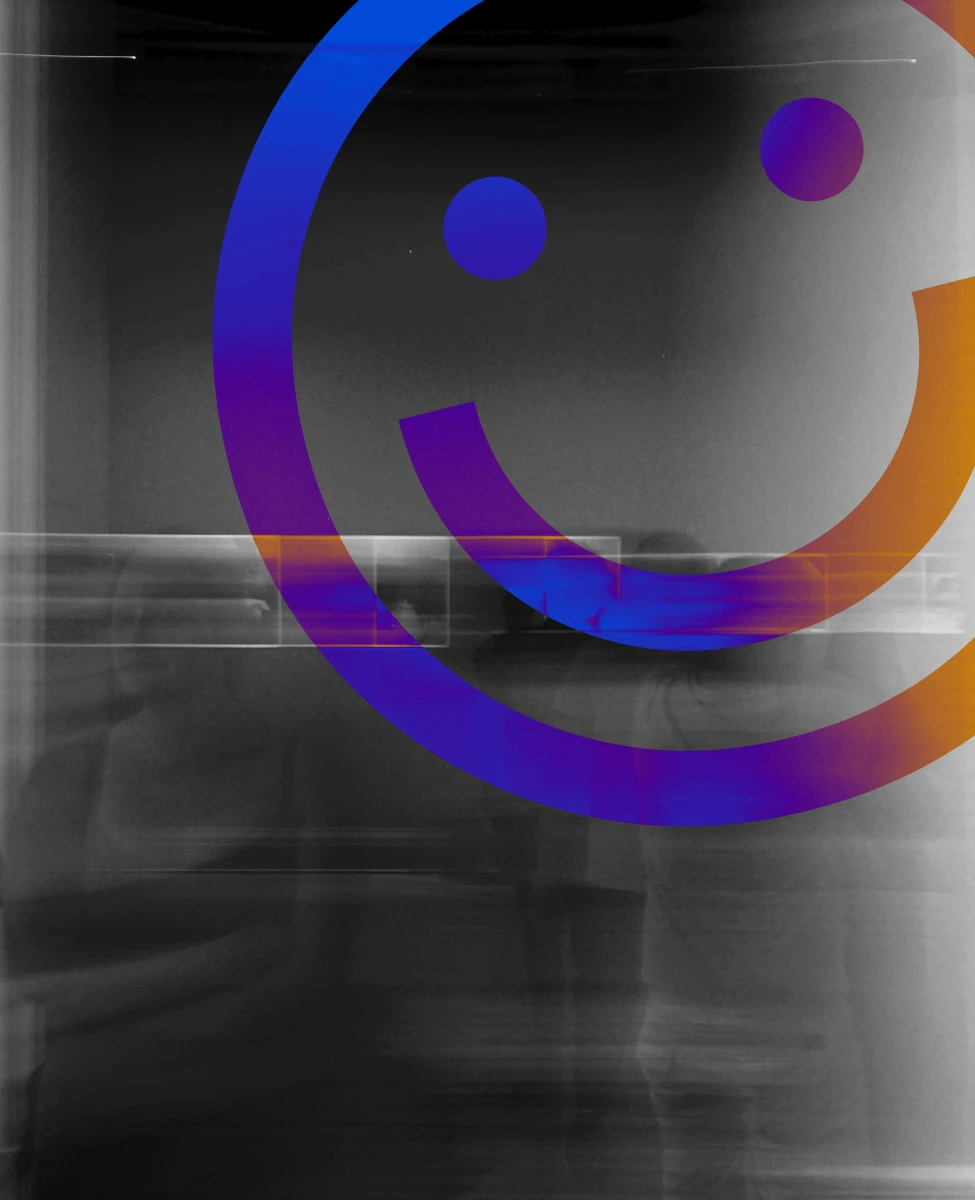
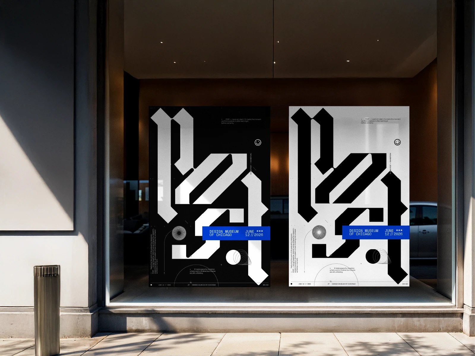
°‎ ‎ ‎ ‎ ‎ ‎ ‎ ‎ ‎ ‎ ‎ ‎ ‎ ‎ ‎ POST is about the shift from student to working designer, where each project responds to a larger problem in a personal way. The POST type is a custom blackletter designed by our team. Its sharp edges are softened with rounded details and circular forms to make it feel more open and approachable.
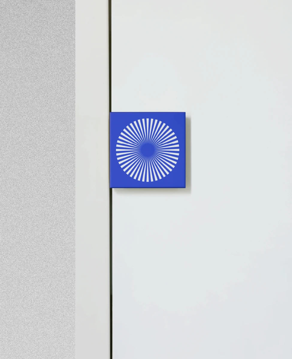
°‎ ‎ ‎ ‎ ‎ ‎ ‎ ‎ ‎ ‎ ‎ ‎ ‎ ‎ ‎ The layout uses an asterisk system to connect elements across the page. Materials like masking tape, vellum, and binders reference critique culture, process, and iteration. A subtle detail is the 44 lines, acting as an easter egg for the full cohort.
Carried Identity
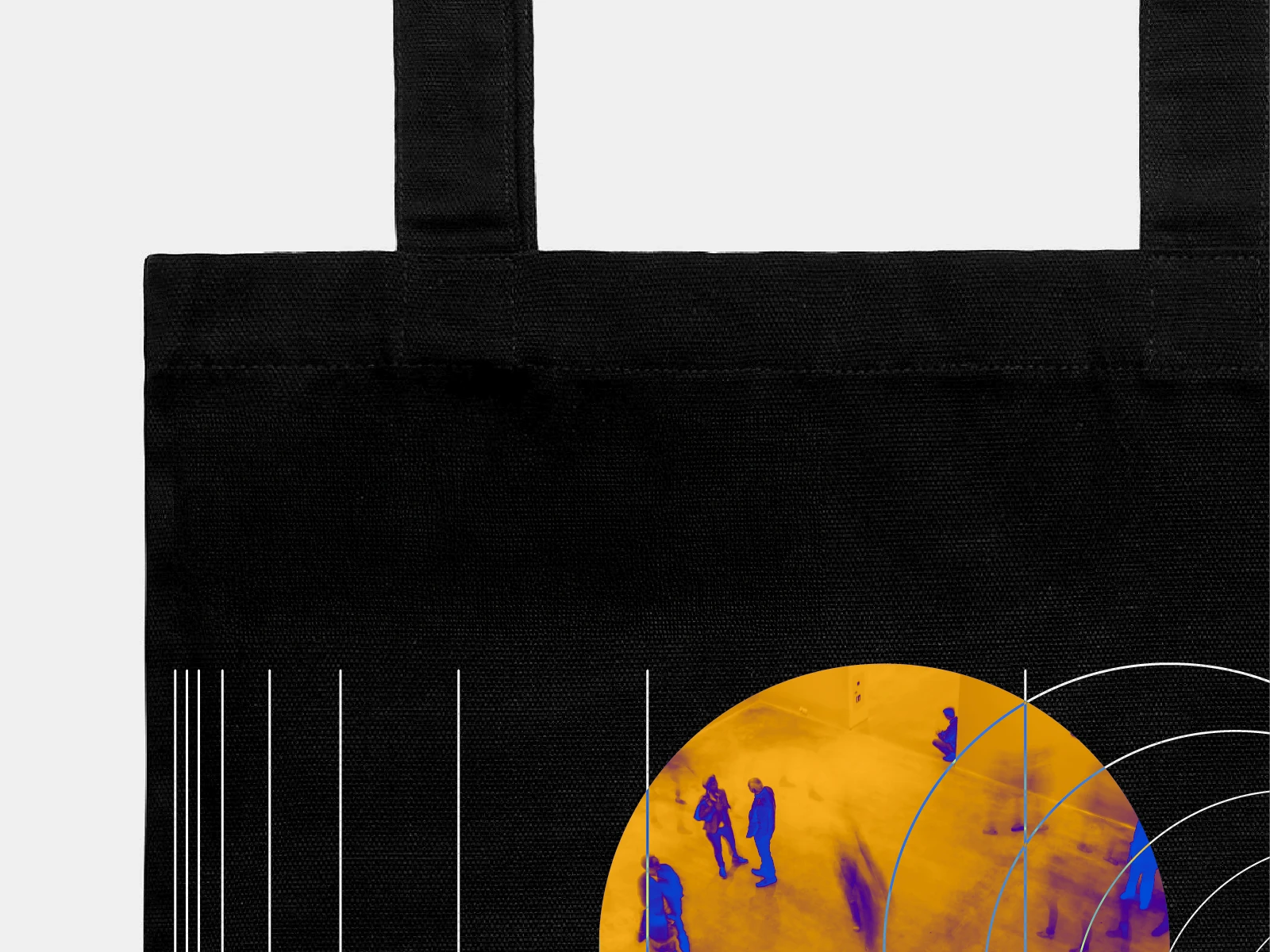
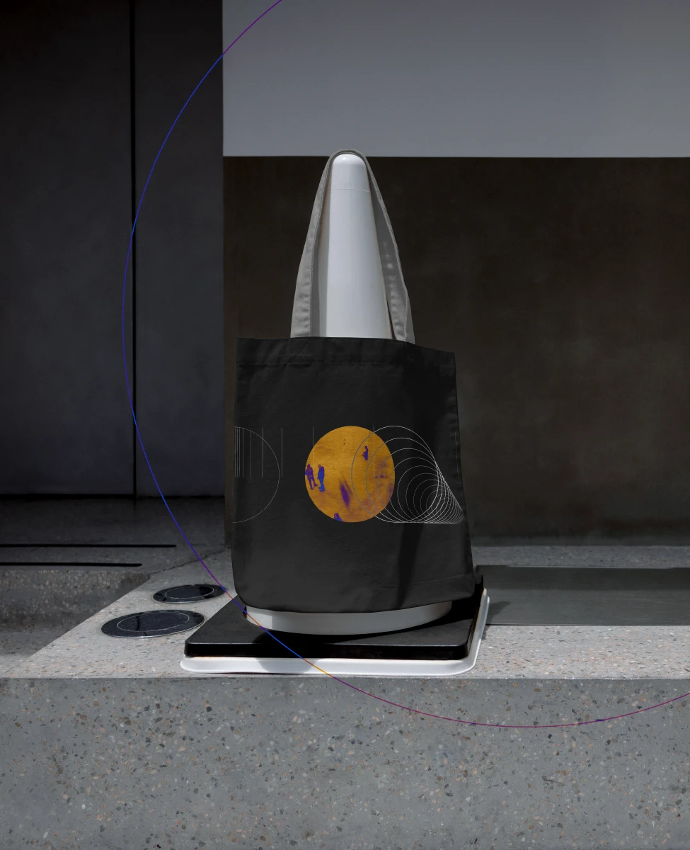
°‎ ‎ ‎ ‎ ‎ ‎ ‎ ‎ ‎ ‎ ‎ ‎ ‎ ‎ ‎ The tote translates the identity into something people can carry beyond the exhibition. It uses the same system of lines, circles, and typographic fragments, but in a more open layout that wraps around the surface. This makes it feel less like a fixed poster and more like a living part of the system.
Carried Identity
°‎ ‎ ‎ ‎ ‎ ‎ ‎ ‎ ‎ ‎ ‎ ‎ ‎ ‎ ‎ It was designed to be visually bold from a distance while still holding smaller details up close, keeping the idea of layering and discovery present even in a simple object.
Layered Guide
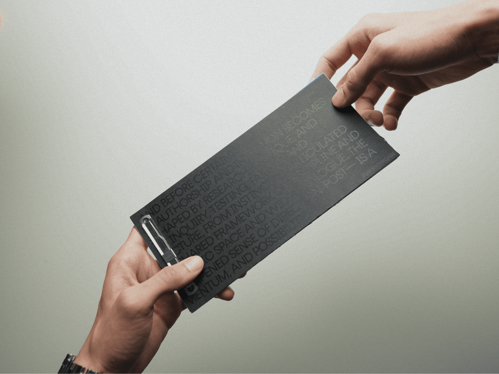
°‎ ‎ ‎ ‎ ‎ ‎ ‎ ‎ ‎ ‎ ‎ ‎ ‎ ‎ ‎ The catalogue is both a guide and a keepsake. The black-on-black cover creates a subtle reveal when it catches light, setting the tone for the rest of the piece. Inside, it includes a full exhibition map, artist placements, and dedicated space for interaction through sticker pages and a cut-out divider. A key section walks through the naming and identity process using vellum layers, showing stages from sketching to structure to final output. It makes the thinking behind the work visible, not just the outcome.
Slow Reveal
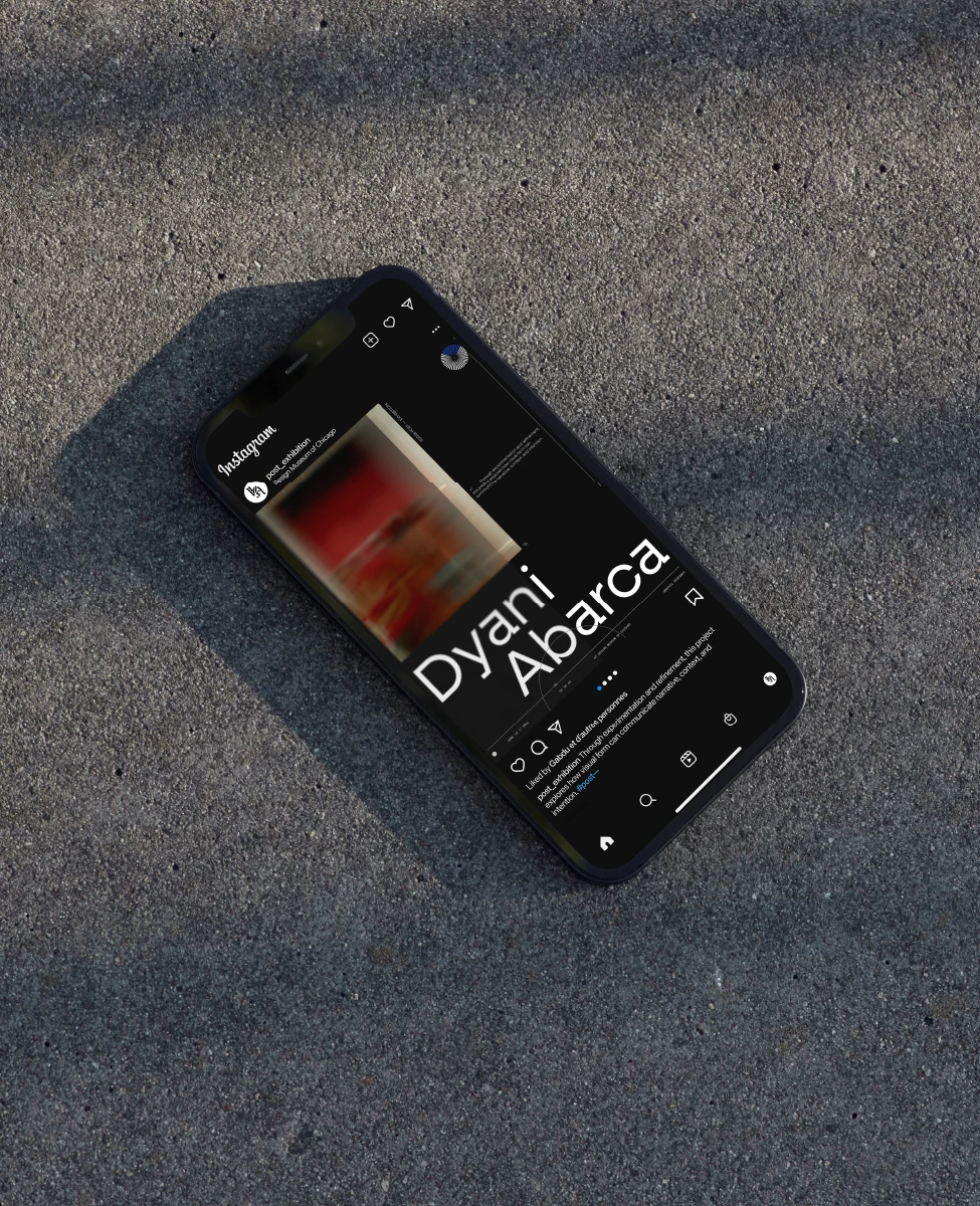
°‎ ‎ ‎ ‎ ‎ ‎ ‎ ‎ ‎ ‎ ‎ ‎ ‎ ‎ ‎ The social rollout was designed to build interest before the show opened. Instead of fully revealing each project, posts use a soft blurred layer that partially hides the work, similar to looking through vellum. This creates a sense of anticipation while still giving enough to engage viewers. As more posts are released, the system builds a rhythm, making the feed feel connected rather than a set of separate announcements.
Open Access
°‎ ‎ ‎ ‎ ‎ ‎ ‎ ‎ ‎ ‎ ‎ ‎ ‎ ‎ ‎ The website extends the exhibition into a digital space, making all 44 projects accessible in one place. It includes a homepage, index, overview, and about section, balancing clear navigation with the ability to browse freely. Each project links out to the designer’s portfolio or social platforms, helping visitors continue the connection beyond the show. The layout carries over the same visual language, using spacing, layering, and structure to reflect the identity while keeping the experience easy to use.
Behind the Scenes
*
°‎ ‎ ‎ ‎ ‎ ‎ ‎ ‎ ‎ ‎ ‎ ‎ ‎ ‎ ‎ Team led by Art Directors, Loveya Chingale and Ellie Sherwood, shaping the overall identity and visual direction. Merchandise direction by Dyani Abarca and Yale Yu extended the system into physical outputs. Project managed by Jason Welch, with social media led by Anna McCauley and motion graphics by Jadyn Milem, bringing the identity across digital platforms.