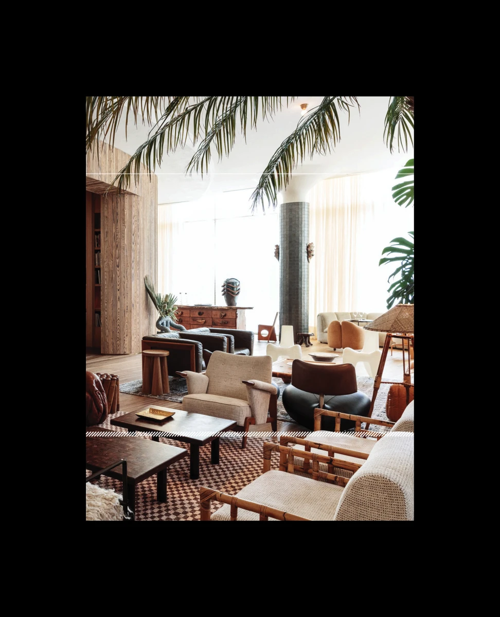
Beyond Boundaries.
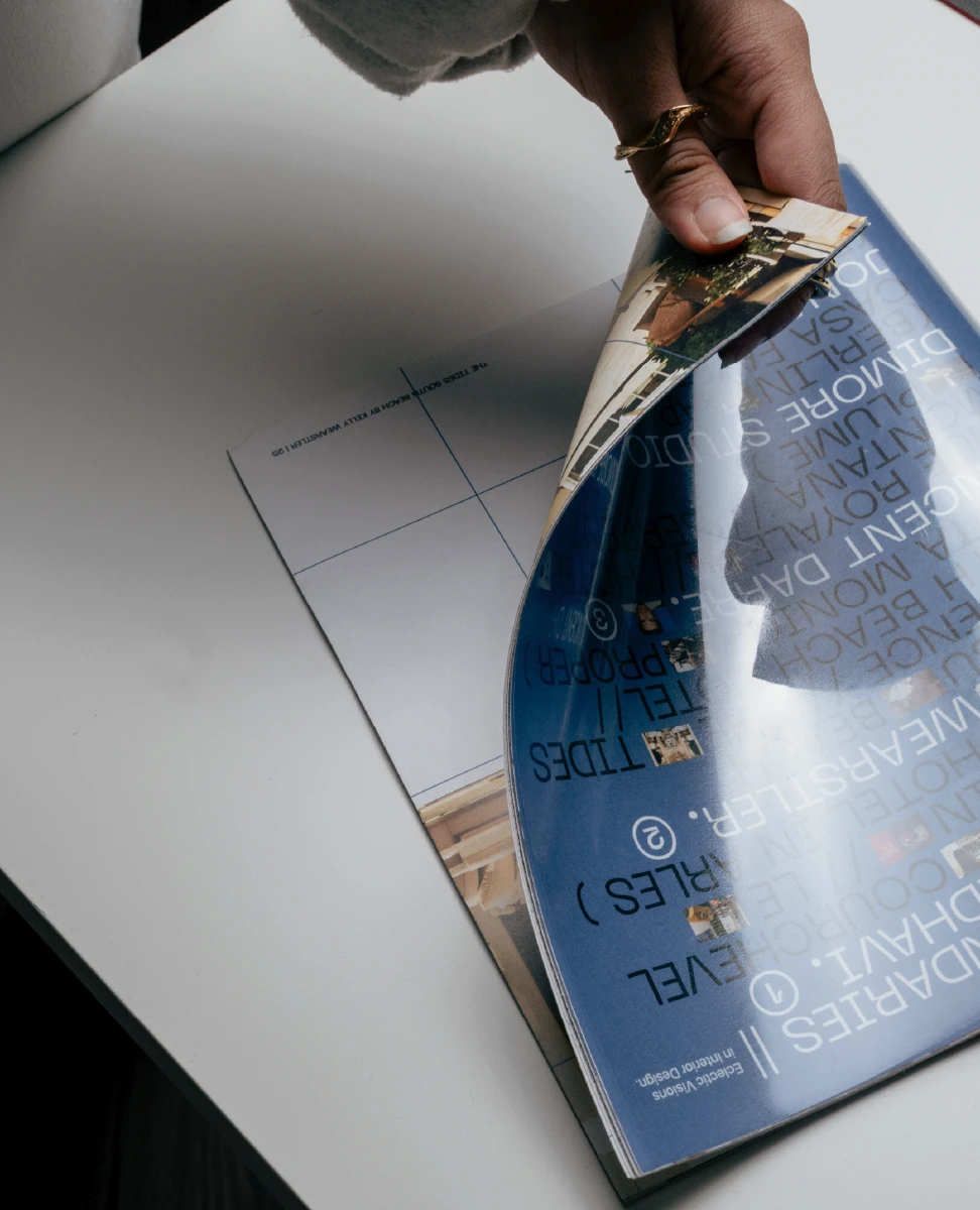
Beyond Boundaries is an editorial publication exploring five interior designers whose practices challenge conventional ideas of space, material, and expression.⎯⎯Created as an exercise in editorial design, the 60-page magazine balances long-form reading with expressive layouts, allowing each designer’s work to shape the rhythm and pacing of the publication.
/
Editorial Design / Publication
/ Typography
⎯⎯2025
Academic Project

°°°°°°°
/
Editorial Design / Publication
/ Typography
⎯⎯2025
Academic Project

°°°°°°°
°/
Setting the visual tone.
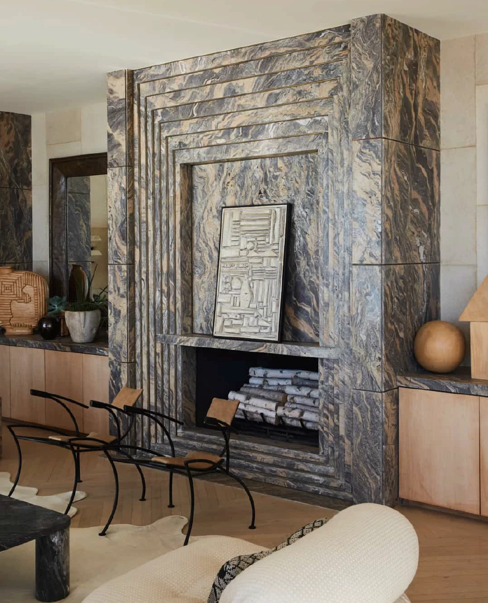
The publication begins by establishing an atmosphere before introducing any written content.⎯⎯Large imagery, generous white space, and restrained typography allow the reader to ease into the publication while hinting at the diversity of interiors featured throughout the magazine.
⎯⎯
°//
Building rhythm through layout.
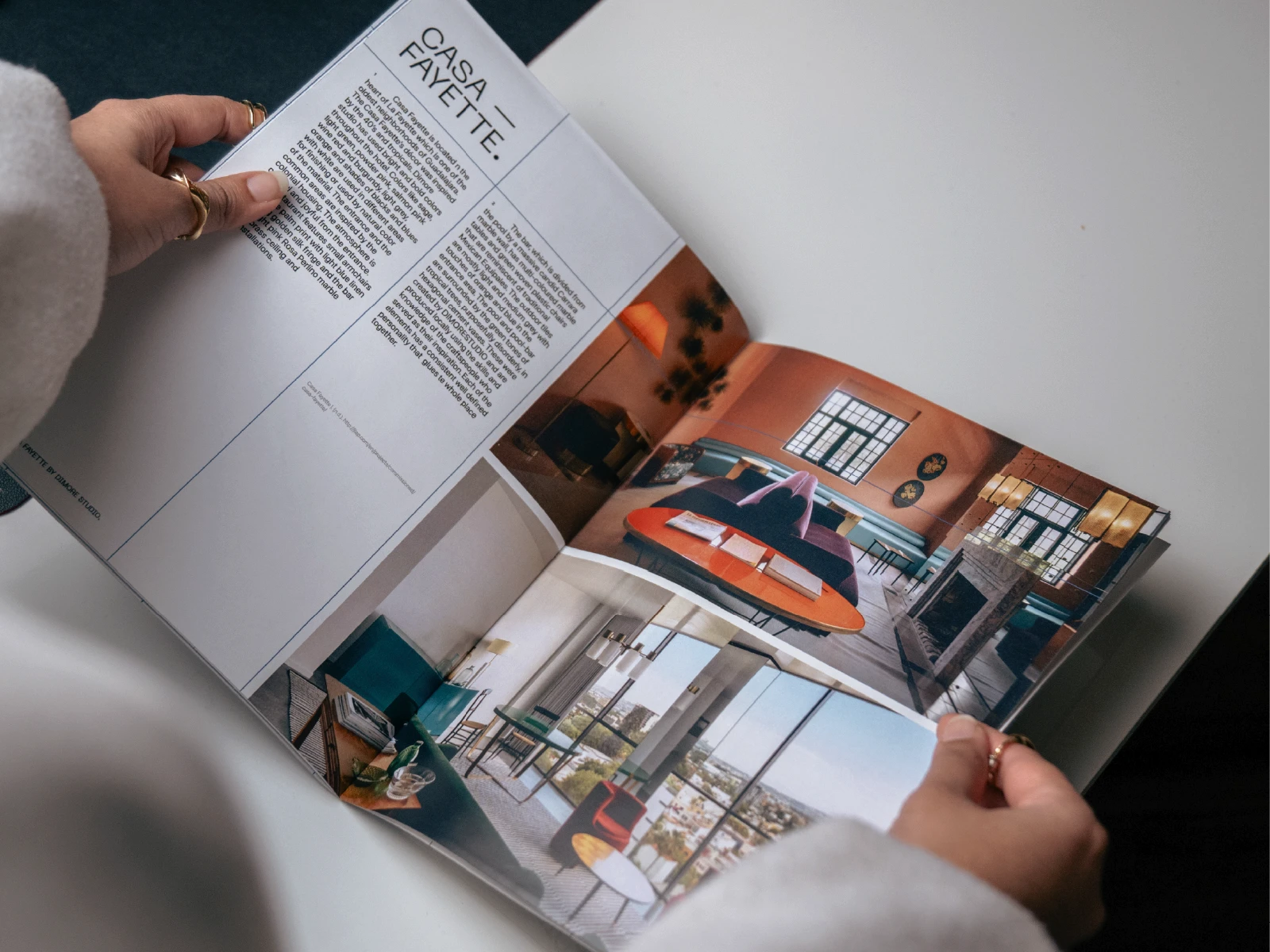
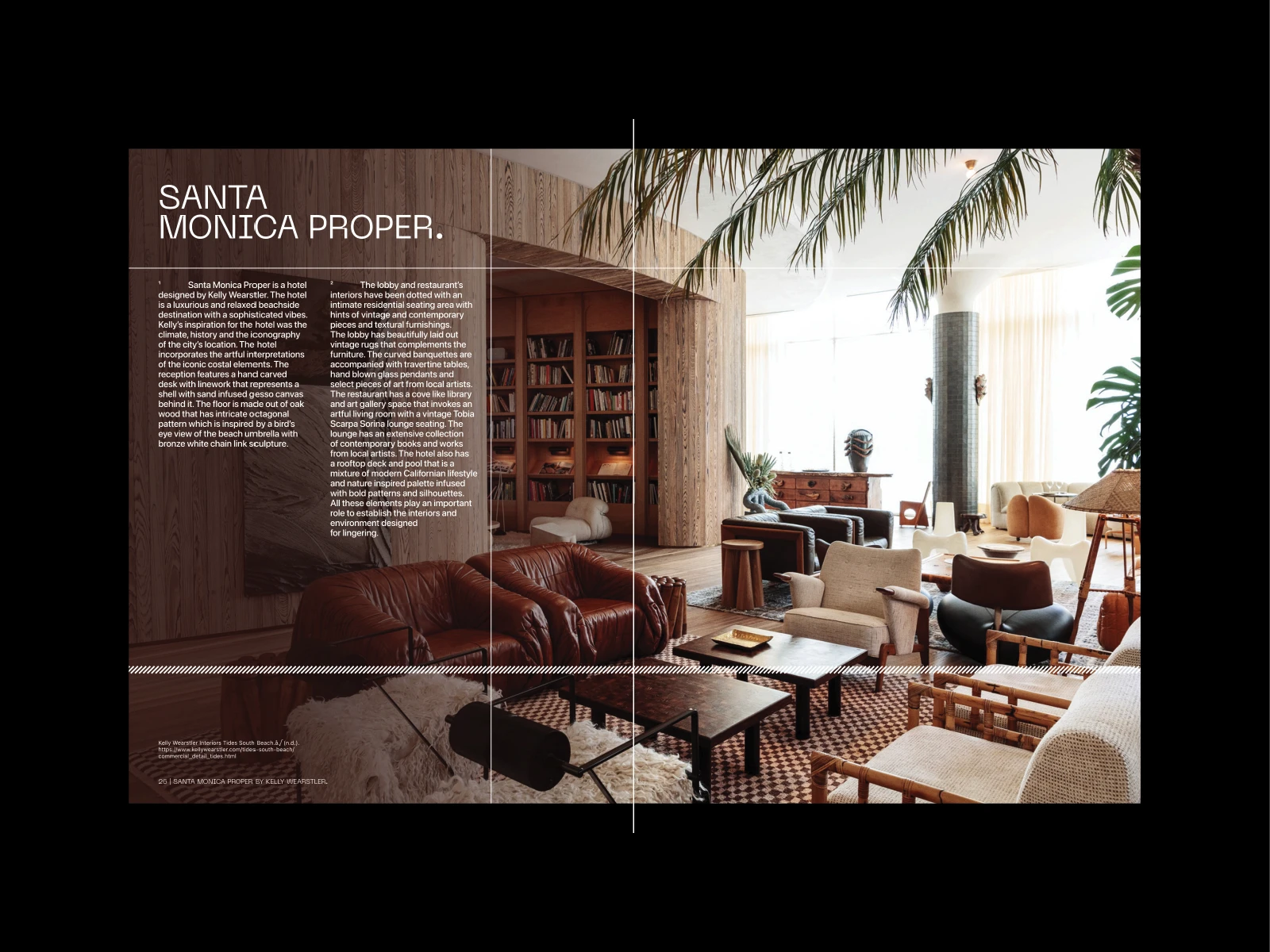
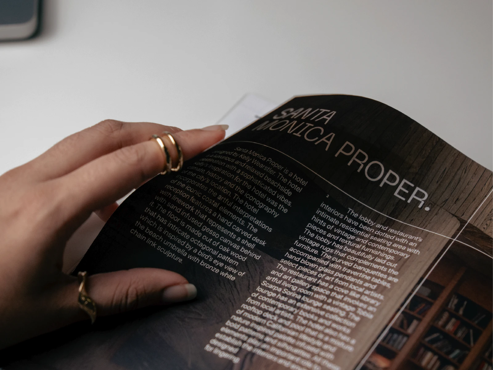
Rather than relying on a single page structure, the layouts shift throughout the publication to maintain a sense of movement.⎯⎯Variations in image scale, text placement, and pacing create moments to pause, explore, and continue reading without disrupting the overall system.
⎯⎯
°///
Designing for long-form reading.
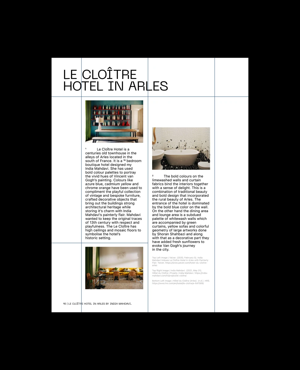
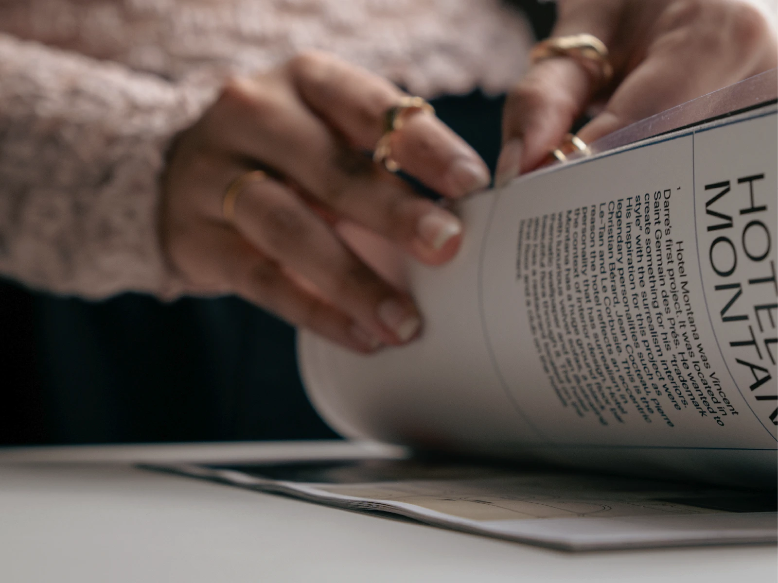
With nearly sixty pages of content, readability became just as important as visual expression.⎯⎯A consistent grid, typographic hierarchy, and modular layout system provided enough structure for lengthy articles while allowing each spread to feel distinct from the last.
⎯⎯
°////
Five designers. Five perspectives.
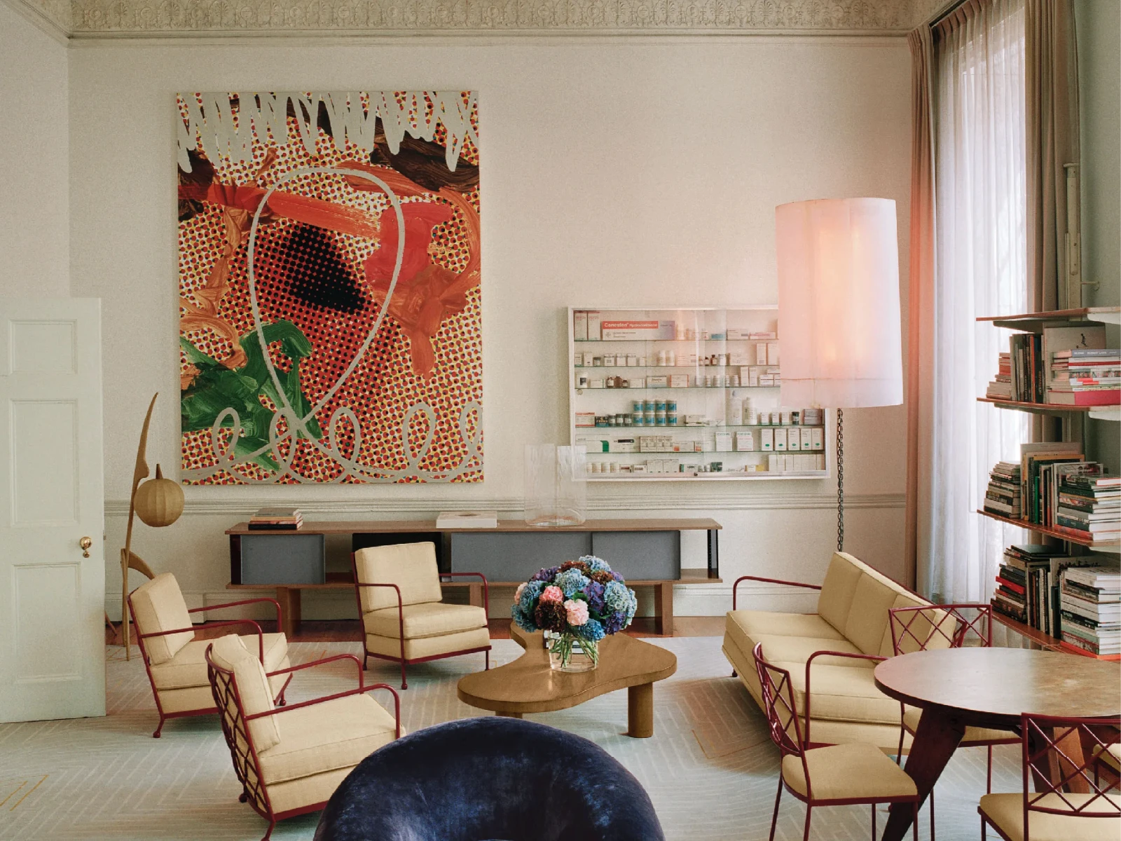
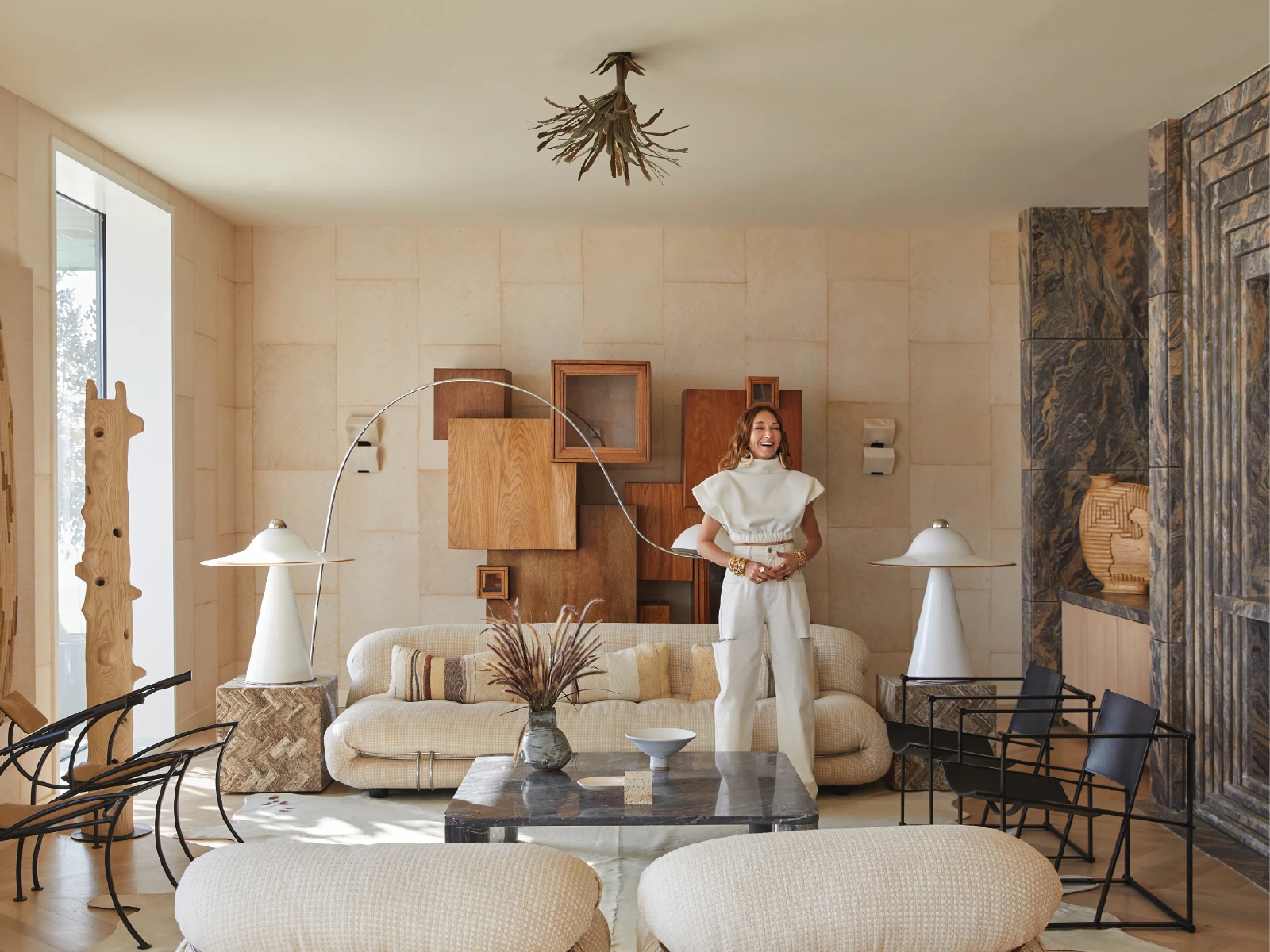
The publication features the work of India Mahdavi, Kelly Wearstler, Vincent Darré, Dimorestudio, and Jonathan Adler.⎯⎯Each section explores a different approach to interior design through selected projects, visual references, and editorial storytelling.⎯⎯Rather than comparing their practices, the magazine highlights the individuality that defines each designer’s work.
⎯⎯
°/////
A system behind every spread.
Every page was developed using the same underlying design system.⎯⎯An eight-column grid, baseline grid, consistent spacing, and a restrained typographic palette created a flexible framework capable of supporting different types of content without sacrificing consistency.
⎯⎯
°//////
From system to publication.
Once the editorial framework was established, each spread became an opportunity to balance imagery, typography, and white space in different ways.⎯⎯The result is a publication that remains visually consistent while allowing every feature to develop its own identity and pacing.
⎯⎯
°///////
An exploration in editorial design.
Beyond Boundaries became an opportunity to explore how typography, layout, and sequencing shape the reading experience.⎯⎯Rather than treating editorial design as page decoration, the project focuses on building a publication that remains engaging from cover to cover while giving every designer an equally distinctive voice.
⎯⎯