Clinique.
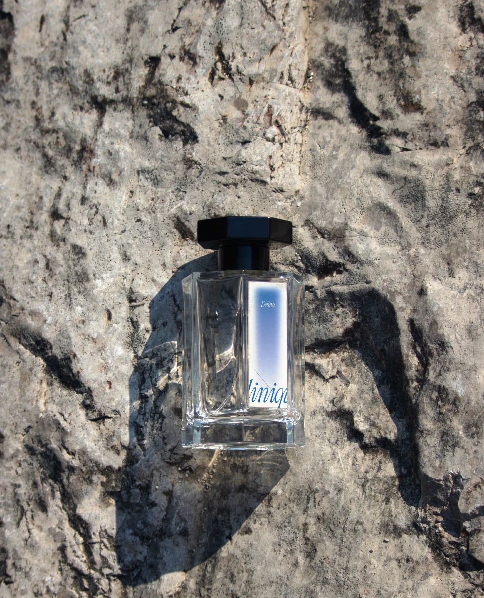
A packaging redesign that reimagines the brand for a younger generation without losing the trust it has built over decades.⎯⎯Rather than moving away from its clinical foundation, the project softens the visual language through packaging, typography, and color while maintaining the clarity and confidence associated with dermatologist-developed skincare.⎯⎯The result is a system that feels more approachable, expressive, and relevant to a new audience.  
/
Packaging Design / Brand Refresh
/ Visual Identity⎯⎯2025
Academic Project

°°°°°°°
/
Packaging Design / Brand Refresh
/ Visual Identity⎯⎯2025
Academic Project

°°°°°°°
°/
A familiar brand, reimagined.
The redesign began by identifying an opportunity to bridge the gap between clinical credibility and emotional appeal.⎯⎯The updated visual language introduces softer colors, refined typography, and contemporary photography while preserving the clarity that has long defined the brand.⎯⎯The goal was to make Clinique feel more approachable without compromising its reputation for science-backed skincare.
⎯⎯
°//
Expanding the product line.
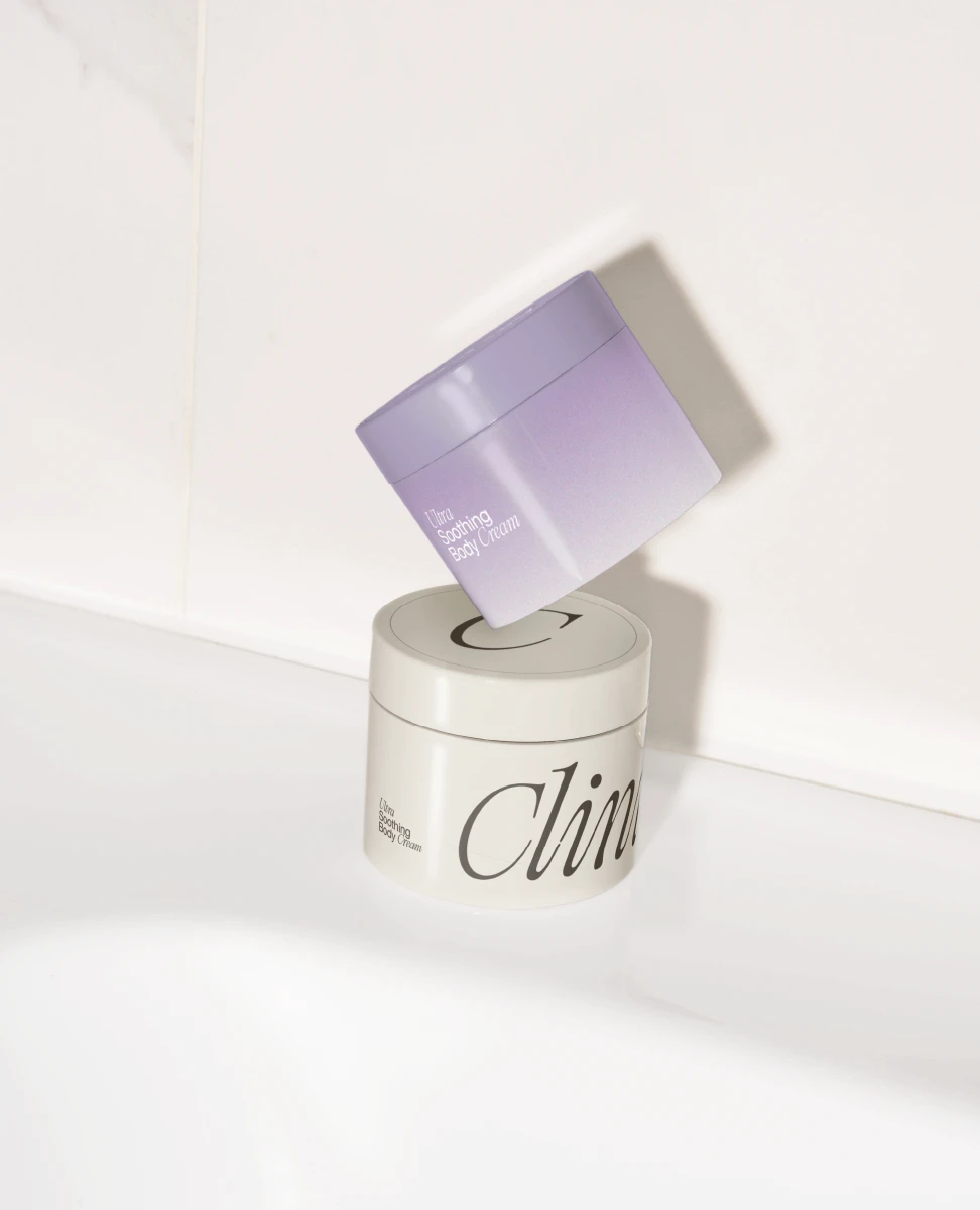
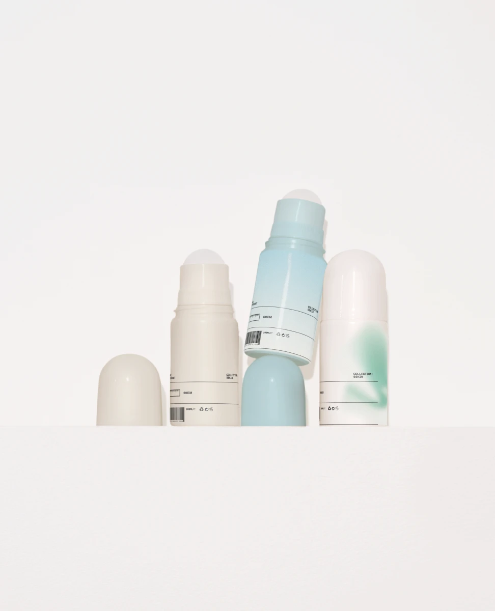
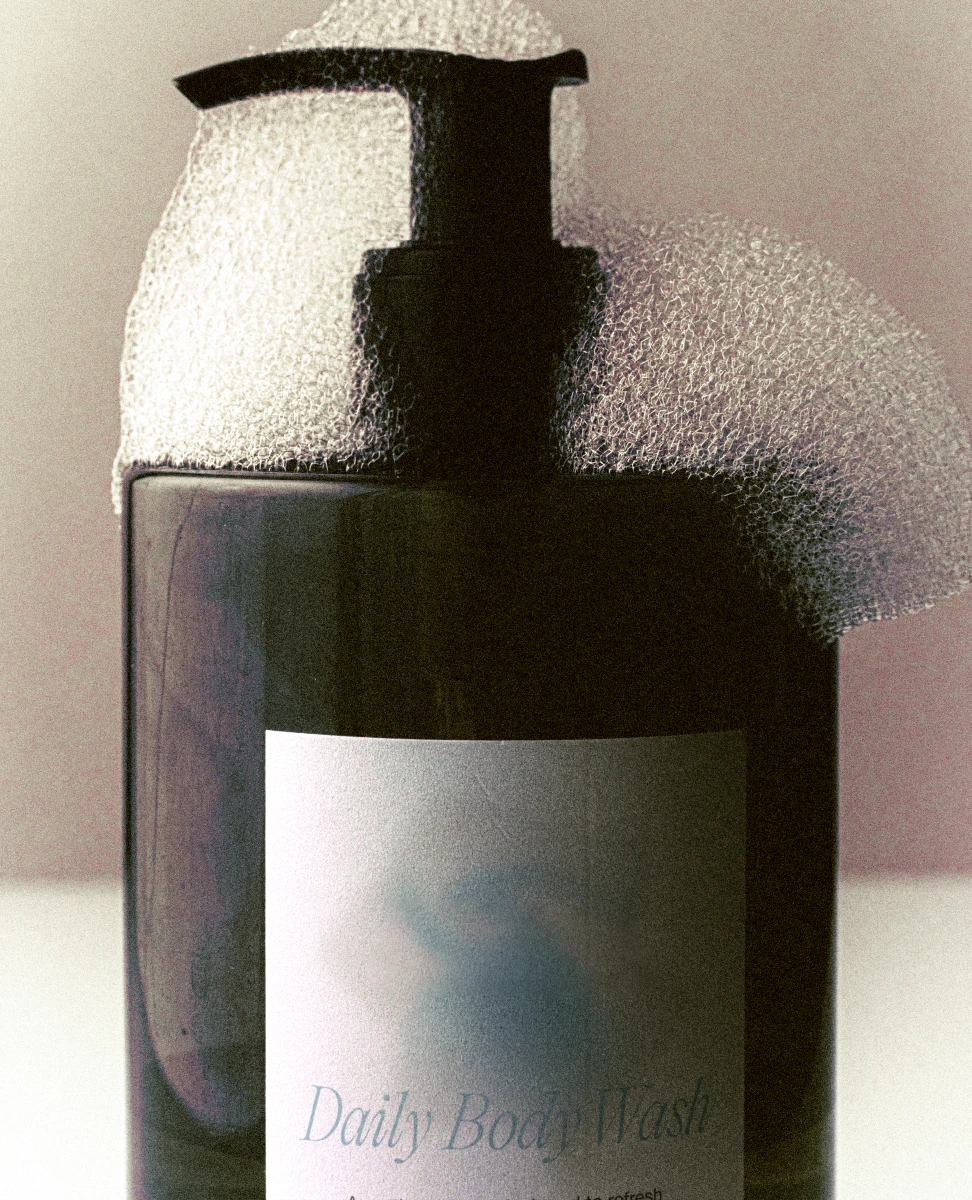
The identity extends across multiple packaging formats including body creams, deodorants, body wash, and skincare essentials.⎯⎯Although each product serves a different purpose, they share a consistent visual system that keeps the collection recognizable across shelves and digital platforms.⎯⎯Color becomes a simple way to distinguish products while maintaining a unified identity.
⎯⎯
°///
Built for production.
Every package was developed from production-ready dielines before moving into mockups.⎯⎯Structural layouts, measurements, folds, and panel organization were considered alongside the graphics to ensure the system could translate from concept into physical packaging.⎯⎯The result balances manufacturing requirements with visual clarity.
⎯⎯
°////
Designed in the details.
Information hierarchy plays an important role throughout the packaging system.⎯⎯Ingredients, warnings, product descriptions, and branding are organized to remain easy to navigate without overwhelming the design.⎯⎯Small details such as typography, spacing, and color work together to create a premium yet approachable experience.
⎯⎯
°/////
Packaging as a system.
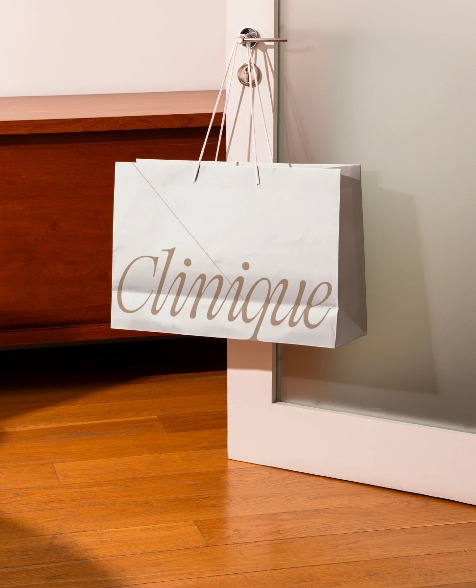
Rather than designing individual products, the project focuses on building a flexible packaging system.⎯⎯Boxes, bottles, shopping bags, and supporting touchpoints all follow the same typographic hierarchy, proportions, and graphic language.⎯⎯This consistency allows the identity to scale naturally across future product categories.
⎯⎯
°//////
Designed beyond the shelf.
The identity was explored through advertising, photography, and retail applications to understand how the packaging performs outside of the product itself.⎯⎯Soft lighting, natural textures, and minimal compositions reinforce a brand experience that feels contemporary, confident, and approachable.⎯⎯Packaging becomes part of a larger visual language rather than a standalone object.
⎯⎯
°///////
Packaging with purpose.
This project explores how packaging can reposition an established skincare brand without abandoning the qualities that made it recognizable in the first place.⎯⎯By balancing clinical credibility with a softer and more contemporary visual language, the redesign creates a system that feels both familiar and relevant to a new generation.
⎯⎯
/
NEXT PROJECT
Delta Airlines
⎯⎯Brand Identity 07
/
NEXT PROJECT
Delta Airlines
⎯⎯Brand Identity 07
/
NEXT PROJECT
Delta Airlines
⎯⎯Brand Identity 07